Can a home keep its heritage soul while embracing clean design and smart living?
We pair the richness of regional hues with simple lines to craft a timeless living space. Our process starts with a neutral base so heritage colours and artisanal elements stand out without crowding the room.
In practice, we use saffron, indigo, emerald and maroon as accent tones across a calm wall and furniture palette. This helps patterns, handloom textiles and brass accents read as curated highlights rather than clutter.
We outline clear steps in this guide—choose a palette, plan room sequence, and place pieces so each area feels cohesive. These ideas scale across compact flats and large homes, keeping function and warmth in balance.
Understanding Indian Heritage Hues in Today’s Interiors
Heritage hues carry stories; we show how to use them so rooms feel both rooted and fresh. In this section we decode what warm and deep pigments signal and how clean design choices make them sing.
From saffron to indigo: what traditional colors signal in indian homes
Saffron signals spiritual vitality and energy. Indigo and turmeric yellow recall artisanal dye crafts. Emerald and maroon reference royal textiles, while vermilion suggests auspiciousness.
Modern design cues in India: neutral bases, clean lines, natural light
Contemporary living favors white, cream, and beige as base walls. Open plans and modular storage keep pathways clear and make bold accents work harder.
- Use a single heritage element—jaali, brass lamp, or a handloom textile—to anchor a room.
- Pair patterned ikat or block prints with calm walls to avoid cluttered looks.
- Let natural light deepen warm hues and sharpen cool tones for the final look.
How to Choose a Palette: Traditional Tones on a Modern Canvas
Choosing the right palette shapes how each room feels and flows through the home. We start with a neutral canvas on walls and larger furniture so accents read clearly and the space stays grounded.

Start with neutrals, then layer
We recommend white, cream, or beige for walls and big pieces. Add textiles, brass fixtures, and art to introduce familiar tones without overwhelming the room.
High-impact and deep pairings
- Royal blue & gold for a luxe living room statement.
- Terracotta & ivory for warm, earthy poise in an entry or family room.
- Indigo & white for bedroom calm; emerald & maroon for dramatic dining.
Soft contemporary options and practical tips
For gentler looks, try pink & gray, lavender & white, or mint & white on upholstery and tiles. Place stronger hues on a single feature wall or one key piece of furniture to keep balance.
| Style | Pair | Use |
|---|---|---|
| Luxe | Royal blue & gold | Living room, accents |
| Earthy | Terracotta & ivory | Entry, tiles |
| Soft | Mint & white | Kitchen, bedroom |
Traditional Indian Colors Modern Interior: Practical Application Framework
A clear framework helps us place heritage tones so every room reads as one coherent home.
We start with the 60-30-10 rule: assign 60% to neutral walls and large surfaces, 30% to a supporting hue across furniture or rugs, and 10% to metallics, patterned textiles, or art as accents. This balance keeps an open plan from feeling fragmented and helps each space flow into the next.

Mapping by function and light
Place energizing tones in high-activity rooms and softer palettes in rest areas. Test paint on walls at different times to see how warm noon light or monsoon gloom shifts saturation.
- Repeat one secondary color across adjacent spaces to connect zones.
- Use brass or copper lighting and small decor for the 10% accent without crowding furniture.
- Count big wood pieces—like a teak console or Sheesham table—as part of the 30% or the 10% based on stain depth.
| Step | Assign | Examples |
|---|---|---|
| Base | 60% | walls, large sofas |
| Support | 30% | rugs, curtains, wood pieces |
| Accent | 10% | lighting, cushions, art |
Materials, Finishes, and Patterns that Anchor the Palette
We anchor palettes with tactile finishes that age well and need little fuss. Choosing honest materials helps paint and fabrics read as part of a single plan.
Wood and stone bring warmth and resilience. Terracotta and classic tiles add texture and climate-friendly thermal mass. A single statement furniture piece, like a Sheesham sideboard with brass inlay, can set the tone for the rest of the home.

Metalwork and carved screens
Jaali-style panels, reworked in wood or metal, add privacy and sculpt light. Brass and copper lighting update diya forms and work well with royal palettes.
Textiles and pattern placement
Ikat, block prints, and paisley bring controlled movement. Use patterns on cushions, rugs, and throws so you can refresh looks without repainting walls.
- Repeat a wood stain and metal tone two to three times across rooms for continuity.
- Use sealed stone or polished tiles in high-traffic zones for durability and coolness.
- Layer small pieces seasonally to change mood while keeping core materials fixed.
| Material | Best Use | Benefit |
|---|---|---|
| Wood | Furniture, screens | Warmth, artisanal feel |
| Stone | Floors, countertops | Durability, thermal comfort |
| Terracotta tiles | Entry, patios | Texture, climate-suited |
| Brass/Copper | Lighting, hardware | Rich accents, patina over time |
Lighting Strategies to Enhance Color Depth and Mood
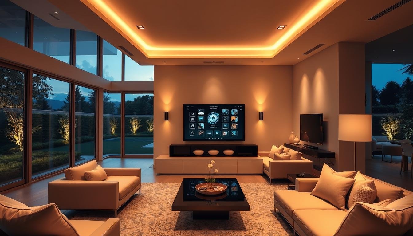
Good lighting defines how paint, textiles, and finishes read after sunset. We plan light so rooms shift easily from lively use to calm evenings without changing the palette.

Warm vs cool light: bringing out saffron, marigold, teal, and charcoal
Warm light (2700K–3000K) deepens saffron and marigold, making fabrics and terracotta feel richer. Neutral-to-cool light (3500K–4000K) sharpens teal and charcoal, creating crisp contrast on walls and furnishings.
Fixtures and layering that respect the look
We use a layered plan—ambient, task, and accent—to control depth and mood. Dimmable ambient fixtures set overall tone. Task lamps keep reading and cooking bright. Accent lights highlight art, jaali panels, or textured wood.
| Light Type | Example Fixture | Effect on Palette |
|---|---|---|
| Ambient | Ceiling pendants, recessed cans | Sets overall warmth; choose 2700K–3500K |
| Task | Under-cabinet LEDs, desk lamps | Provides clear, focused light for activities |
| Accent | Wall washers, picture lights | Deepens color depth on artwork and feature walls |
| Feature | Backlit mandala or jaali | Creates soft focal glow for puja or transition zones |
Brass- or copper-finished pendants and diya-inspired forms bridge heritage and contemporary design. Keep metal finishes consistent so fixtures support the palette rather than compete with it.
We always test bulbs near walls and textiles before committing. Smart scenes and dimmers let us preserve accurate color rendering across activities and times of day.
Room-by-Room Color Ideas for Indian Homes
We map palette choices to each room so every space feels intentional and lived-in.
Living room palettes
Choose one statement pairing: mustard & brown, peacock blue & orange, or charcoal & gold.
Use the deeper tone on a feature wall and echo it through cushions, a rug, and select furniture. Warm wood finishes and brass lighting help the look hold together across the living space.
Bedroom serenity
For calm, pick indigo & white, olive green & cream, or lavender & white.
Apply softer walls and breathable textiles. Keep patterns minimal so the bedroom reads restful and uncluttered.
Dining, puja, kitchen and baths
Dial dining drama with magenta & silver or burgundy & gold. Ground bold walls with a wood table and neutral chairs.
Keep the puja room pure with saffron & white and a soft backlit mandala for a gentle focal glow.
Refresh kitchens and baths with turquoise & gold, mint & white, or coral & gray on tiles or painted cabinetry for easy upkeep.
| Room | Pairing | Where to apply |
|---|---|---|
| Living room | Mustard & Brown | Feature wall, cushions, rug |
| Bedroom | Indigo & White | Walls, bedding, curtains |
| Dining | Burgundy & Gold | Accent wall, artwork, lighting |
| Puja | Saffron & White | Backlit mandala, altar backdrop |
| Kitchen/Bath | Mint & White | Cabinetry, tiles, hardware |
Conclusion
We distill cultural motifs and pragmatic rules into a clear path for rooms that feel both lived-in and refined.
Begin with a neutral base, pick one heritage pairing, and use the 60-30-10 rule to balance scale. Repeat key materials and elements across the space to knit rooms together.
Lighting shapes the depth and mood of every palette; test bulbs and layer fixtures so fabrics and finishes read true at any hour.
Use artisanal textiles, brass or copper touches, and honest materials like stone and wood sparingly to add character and longevity while keeping function central.
These ideas are modular—mix palettes and adapt styles to your home and lifestyle. Keep what serves your story, let trends pass, and make a space you’ll enjoy for years.


