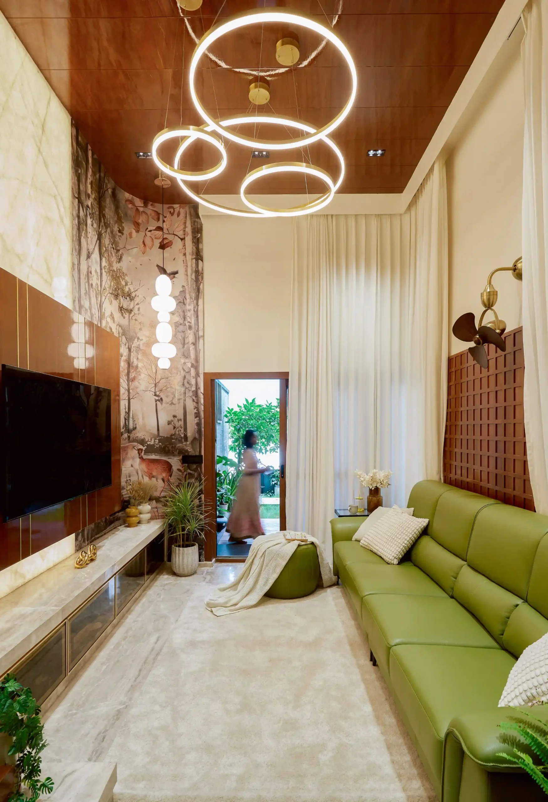
Neutral paint colours are the most popular choice for Indian homes, and also the easiest to get wrong. Two beiges that look the same on a shade card can feel completely different on your wall. One looks calm and warm. The other looks yellow, grey or dull.
The reason is almost never the colour name. It is the undertone, the light in the room, and what you place next to the paint. This guide covers the neutral colours for home interiors that work best, what to pair with each one, and how to choose the right neutral without painting the same wall three times.
What are neutral colours?
Neutral colours are shades that do not shout. White, off-white, cream, beige, greige, grey and taupe all count. They give a room a quiet base, so your furniture, wood, art and fabrics stand out instead of fighting the walls.
People often ask whether grey is a neutral colour. Yes, it is. So are the softer browns like taupe and mushroom. What matters is that each neutral leans a little warm (towards yellow, red or brown) or a little cool (towards blue, green or grey). That lean is called the undertone.
6 neutral colours for home interiors
1. Soft white
Soft white is white with a small hint of cream. It is gentler than pure white and does not glare in strong Bangalore sun. It reflects light well, so it makes small rooms feel airy.
- Works with: light oak, teak, bamboo and cane.
- Metals: brass and brushed gold look warm. Matt black gives a sharp, modern contrast.
- Accent colours: sage green, muted terracotta, navy and mustard.
- Best for: ceilings, small bedrooms, passages and rooms with little natural light.
2. Warm beige
Beige is the classic neutral for Indian living rooms, and for good reason. It sits comfortably with wood, stone and cane, and it makes a room feel welcoming. Choose a beige with a light touch. A heavy yellow-beige can turn orange under evening bulbs.
- Works with: teak, walnut and rosewood.
- Metals: antique brass and copper.
- Accent colours: deep green, rust, burgundy and soft blue.
- Best for: living rooms, dining areas and family bedrooms.
3. Greige
Greige is a blend of grey and beige. It gives you the calm of grey without the cold feel. It is a good middle path if you like a modern look but do not want a room that feels clinical.
- Works with: medium and dark wood, and light grey stone.
- Metals: brushed nickel and black.
- Accent colours: dusty blue, olive, plum and warm white.
- Best for: open living and dining spaces.
4. Light warm grey
A warm grey has a touch of brown or pink, so it feels soft and not hard. A light version keeps the room bright. Very dark or very cool greys can make a room feel heavy, so use them in small amounts.
- Works with: pale oak, ash and white marble.
- Metals: chrome, nickel and black.
- Accent colours: coral, teal, mustard and soft pink.
- Best for: studies, modern living rooms and kitchens.
5. Taupe
Taupe sits between brown and grey. It adds depth without making the room dark. It looks rich on a feature wall or on built-in cupboards, and it works well with natural textures like linen and jute.
- Works with: walnut, dark teak and smoked oak.
- Metals: bronze, brass and black.
- Accent colours: cream, forest green, deep blue and blush.
- Best for: master bedrooms, feature walls and wardrobes.
6. Ivory or cream
Ivory is warmer than soft white and has a slightly golden glow. It suits traditional and transitional homes, and it makes carved wood, pooja units and fabric look rich. In a room with cool light, it adds the warmth that is missing.
- Works with: carved teak, cane and light stone.
- Metals: brass, gold and copper.
- Accent colours: maroon, bottle green, indigo and saffron.
- Best for: pooja rooms, dining rooms and north-facing rooms.
Want to see each shade with its matching woods, metals and accent colours? Open our neutral colour palette guide.
How to choose the right neutral
Start with the undertone
Hold the shade card next to a plain white sheet of paper. The lean will show up straight away. Warm undertones (yellow, red, brown) pair with warm wood like teak. Cool undertones (blue, green, grey) pair with grey stone and lighter, paler wood. Do not mix a very warm wall with a very cool floor, because one of them will always look wrong.
Look at the light in the room
Natural light changes a colour more than anything else. A north-facing room gets softer, cooler light, so a warm neutral balances it. A room that gets strong west sun in the afternoon can handle a cooler shade. This is why the same paint looks different in two rooms of the same house.
Check it under artificial light too
Many people only look at the paint in daytime. Look at it again at night under your actual bulbs. A warm yellow bulb can push a beige towards orange, while a cool white bulb can make a grey look blue.
Test a large patch on the wall
A small square on a shade card tells you very little. Paint a patch of at least two feet by two feet and look at it in the morning, afternoon and evening. Do this on the wall where the colour will be used, not in a different room.
Decide the ceiling early
A white ceiling over beige walls is the usual answer, but not the only one. A ceiling a shade lighter than the wall feels softer and makes the room feel taller. Choose it together with the wall colour so the two do not clash.
Pick the finish
Matt hides small flaws in the wall and feels soft. A slight sheen is easier to wipe, which helps in passages, kids’ rooms and kitchens.
How to add character to neutral walls
A room painted only in neutrals can look flat. The fix is texture and a few pops of colour, not a bolder wall.
- Use natural materials: wood, cane, stone, jute and linen.
- Layer different tones of the same family, such as a beige wall with a cream sofa and a taupe cushion.
- Add one or two accent colours through curtains, art and cushions, so you can change them later without repainting.
- Use lighting to add depth. Wall washers and warm lamps make neutral walls look rich in the evening.
Where colour fits in a home design
Colour works best when it is planned together with the layout, windows and materials, not picked at the end. Where the light comes in, which wall gets the sun and what the flooring looks like should guide the shade you choose. For more on this, read our guides on colour psychology in home interiors, traditional Indian colour palettes for modern interiors and Vastu colours for the house.
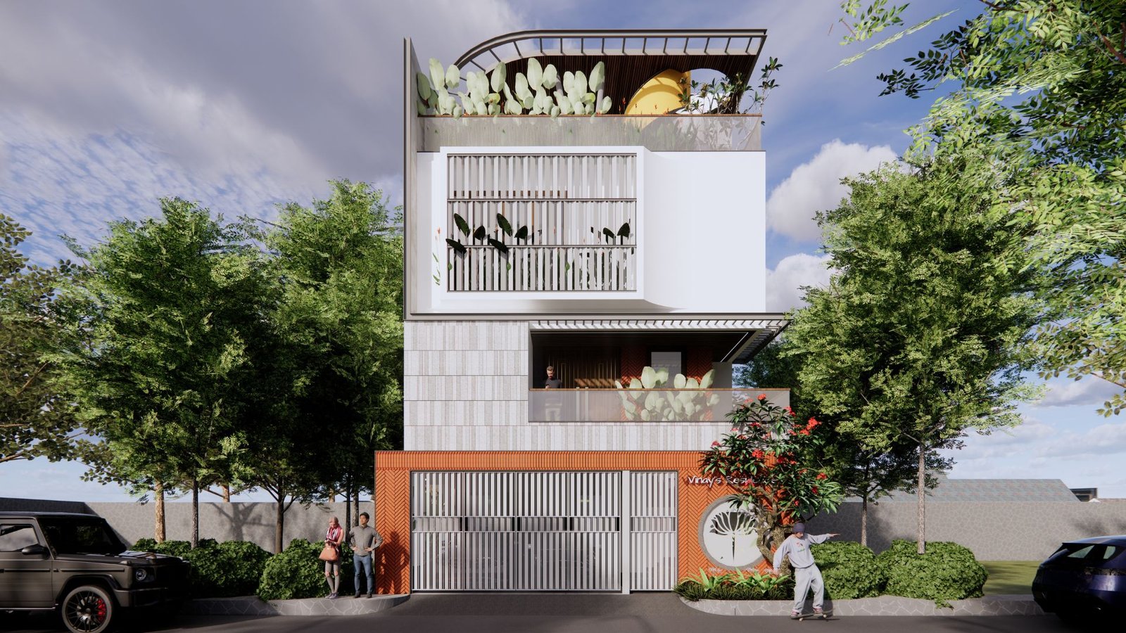
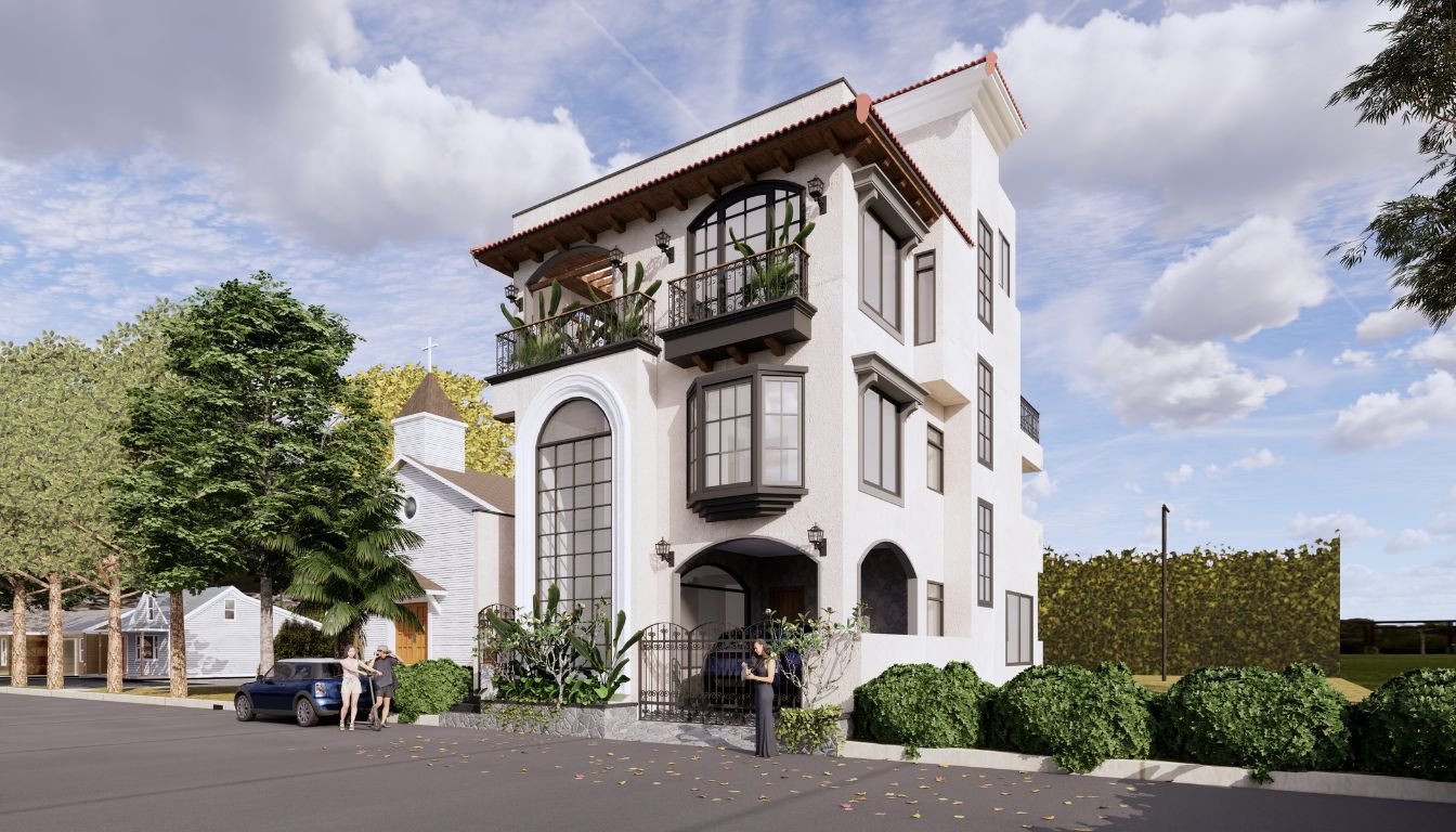
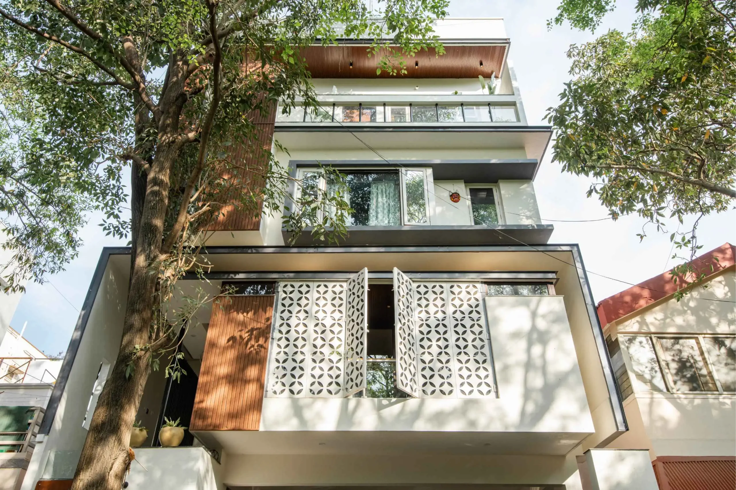
Neutral palettes also suit the clean lines of modern house design, where light, space and material do most of the talking.
Frequently asked questions
What is the best neutral colour for a house?
There is no single best one. Warm beige and soft white are the safest picks for most Indian homes, because they work with teak, cane and stone. The best neutral for your house depends on its light, flooring and wood.
What are the 5 basic neutral colours?
White, beige, grey, taupe and cream are the five basic neutrals. Black and brown are sometimes counted too.
Are neutral colours relaxing?
Yes. Soft, low-contrast colours are easy on the eye, which is why they are common in bedrooms and living rooms. Warm neutrals feel cosier, and cool neutrals feel calmer and more open.
Can neutral colours brighten a home?
Yes. Light neutrals like soft white, ivory and light warm grey bounce light around the room, so a small or dim room feels bigger and brighter.
Can neutral colours work for modern spaces?
Yes. Greige, light warm grey and soft white are the base of most modern interiors. Add black fittings and natural wood for a clean contemporary look.
How do I choose a neutral paint colour for each room?
Match the undertone to the wood and floor, check the colour in daylight and under your night lights, and test a large patch on the wall before you buy the full amount.
Founded by Ar. Varshith V N and Ar. Ranjani N, Aaikya Architects is a CoA-registered practice of residential architects in Bangalore with 55+ completed projects. Planning a new home and want the colours, light and materials to work together from the start? Look at our custom home design approach, or book a consultation and we will talk it through with you.